Free Tool Before and After
I was not even on the software team when this transition came about. I was on the Marketing team and just happened upon a free tool that the company was offering. I found the information to be, well, all over the place, and hard to quickly parse. Even though I did not fully have a grasp of what the tool was all about, I did have a sense of how to order and group information, even information that I did not yet fully understand! So I gently slipped an ideation to someone on the Dev team that we could perhaps approach the UI for the tool another way.
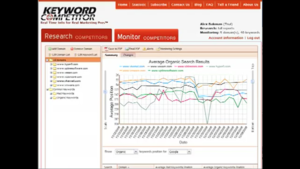
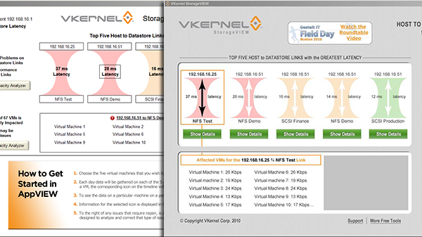
This is the BEFORE version that I happened upon:
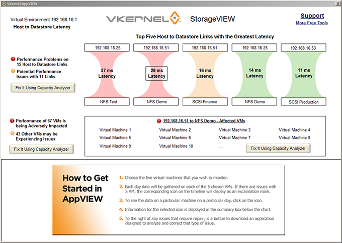
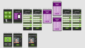
And this is the AFTER ideation I gave to Dev:
Once the CEO laid eyes on my ideation, he order that my version be built. That was probably a tad premature, because you never get it right in one shot. Once a developer on the Dev team saw that it “was allowed” to think differently and offer up new ideas, he made a further suggestion that the “passages” be turned horizontally and stacked. I actually agreed with that second take, but this version was already in the works. Nonetheless, I think the moral of the story is that there is always room for improvement and other perspectives.